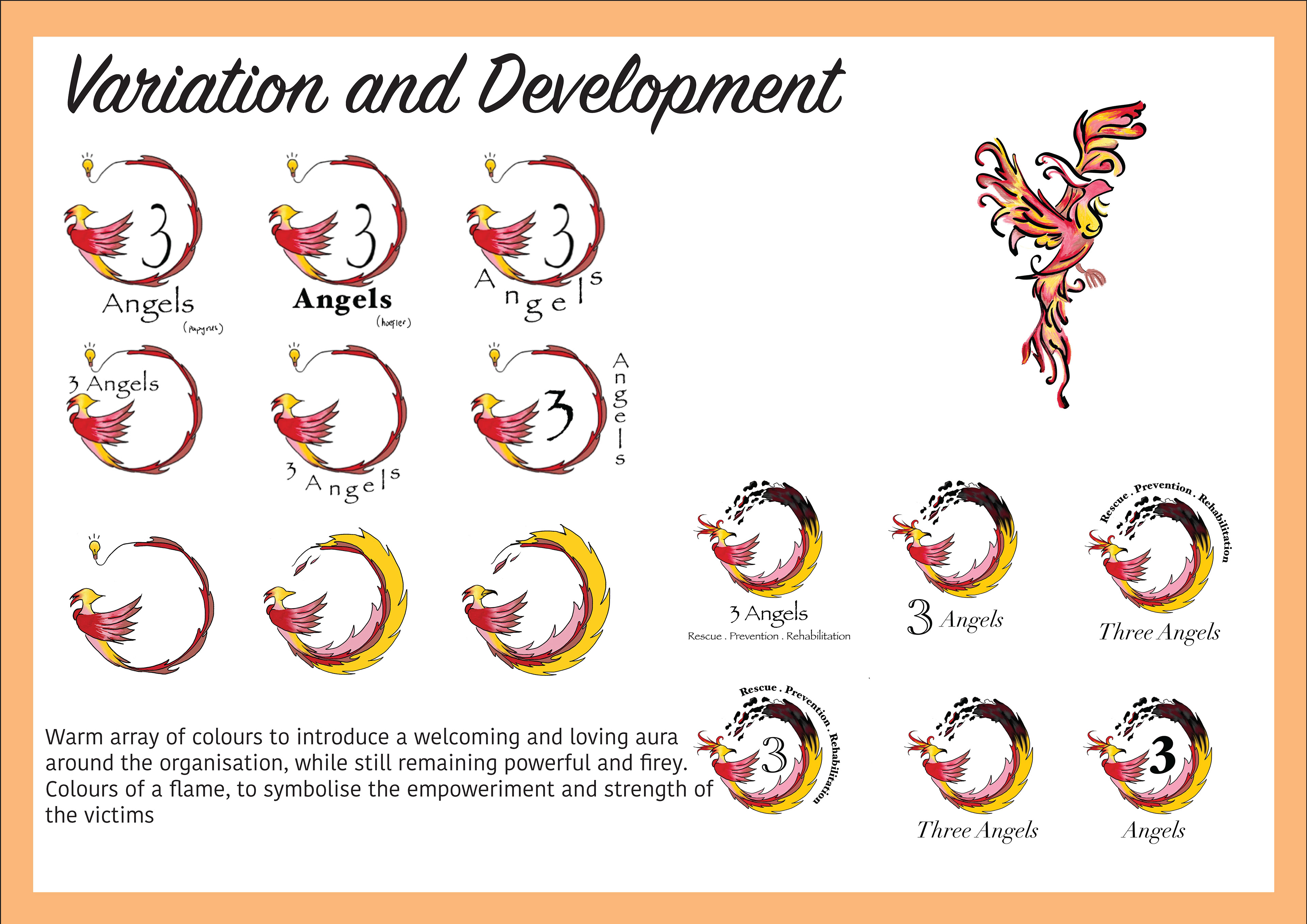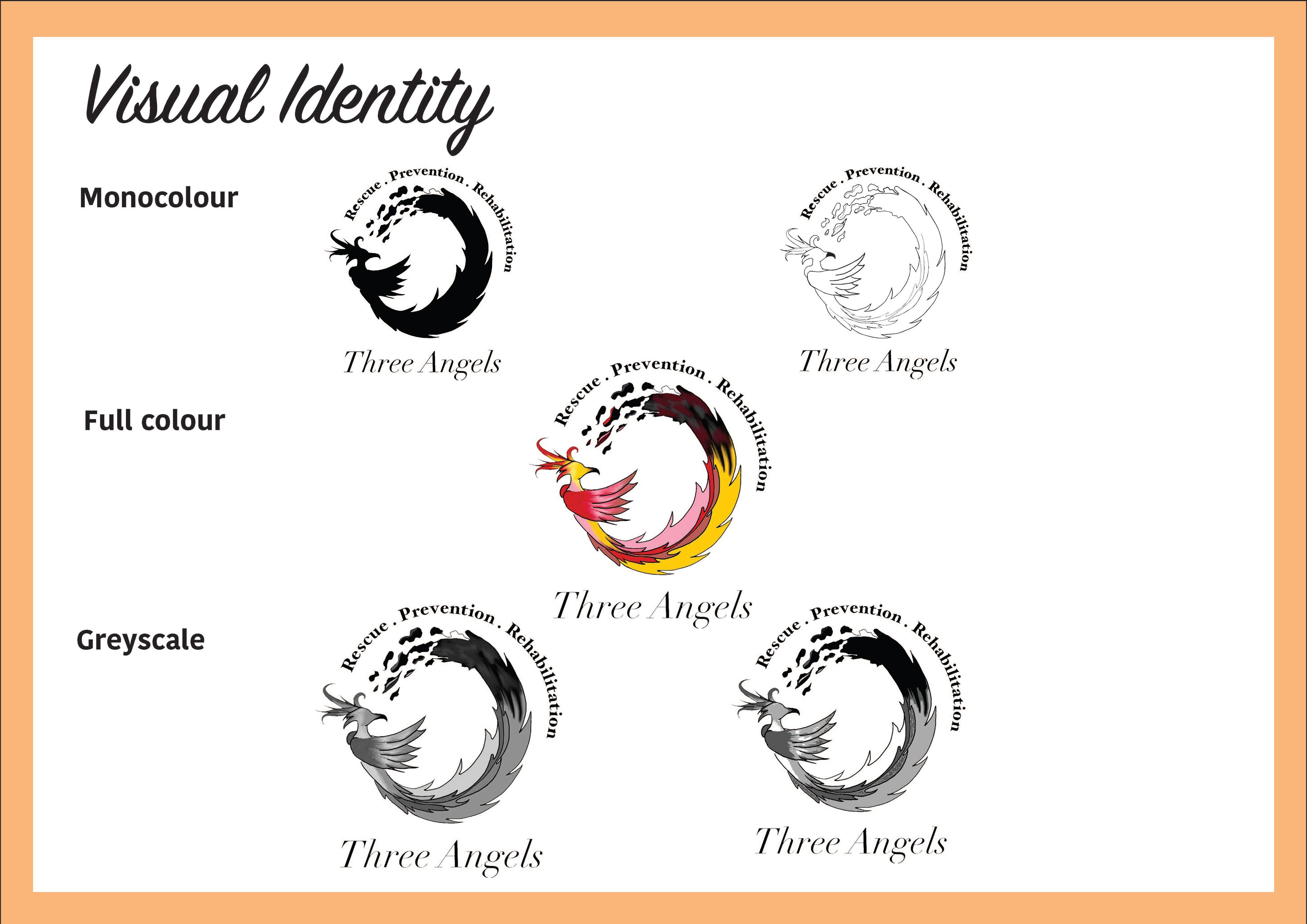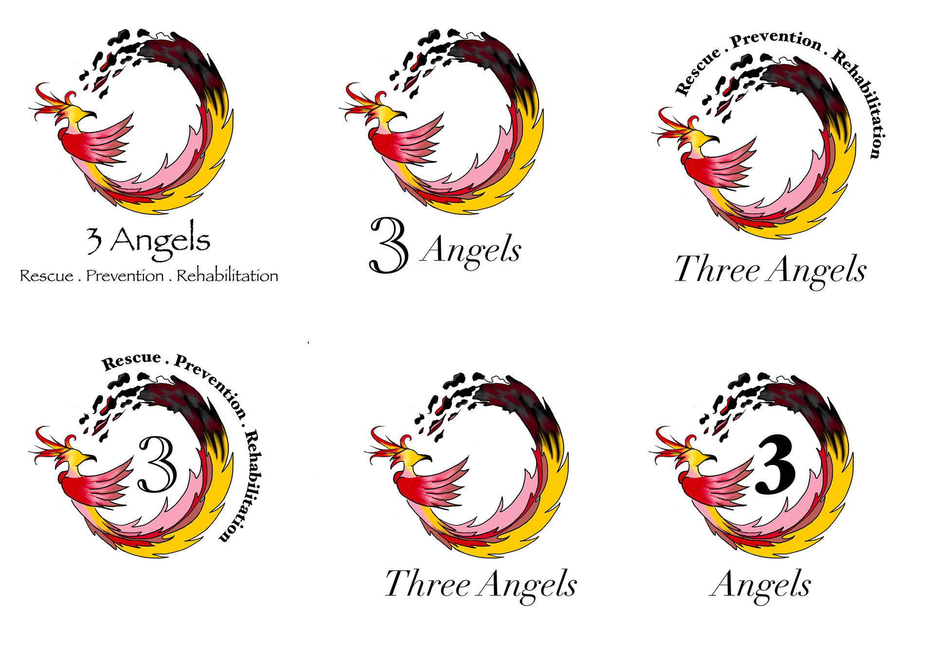
Human trafficking continues to be a silent terror among the modern day, often going unnoticed in other countries that are not ‘at risk’. The Three Angels Australia foundation is one of the organisations working towards improving awareness and seeking help for children and women, who are subject to being trafficked in poorer cities located in Nepal. Their message is strong; focusing on the strength of education to empower young individuals who can then pull themselves out of the pattern of being trafficked. However, their message appears to lose depth in their visualization, where their current logo does not emphasise the organisation’s purpose. In redesigning this, a series of icons that symbolize hope, education and empowerment were explored, concluding that the symbolism of a phoenix would be the most effective. The phoenix is representative of transformation, and rebirth in its fire and is the physical embodiment of strength and renewal; a powerful image to represent the powerful mission of the organization, to transform the environment of the victims and grant them new lives. According to Goethe
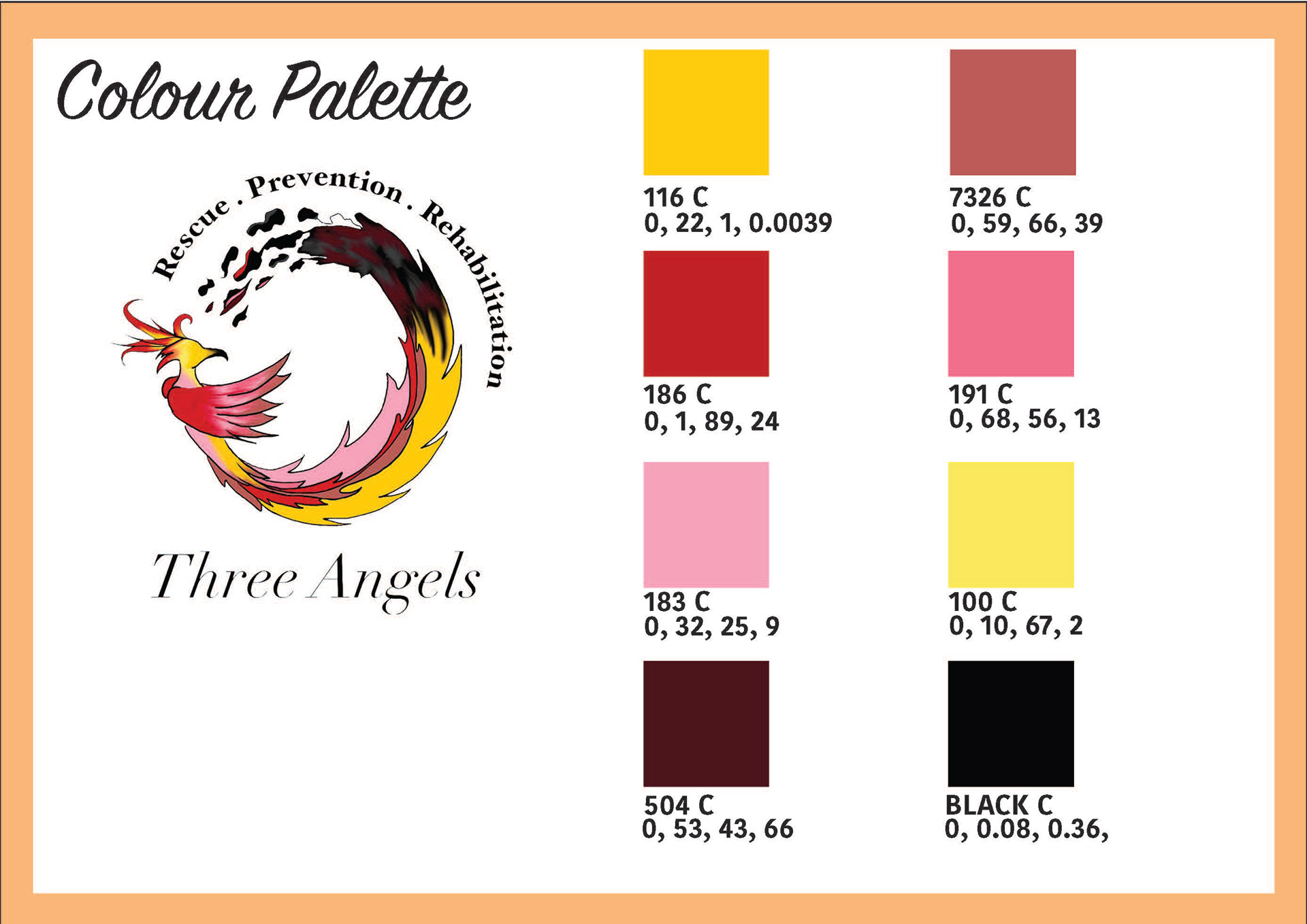
(1810), his Theory of Colours states the link between colour and psychological functioning, where “the ‘plus’ colours of yellow, red–yellow, yellow–red are connected to emotional responding (e.g., warmth, excitement)”. Thus the use of the warm colour palette produces a hospitable, welcoming and maternal aura, while also reinforcing the power and potential in the transformation of the phoenix. Similarly, Meier & Robinson (2005) explore the conceptual metaphoric theory of colour, where they use colours to explain metaphors, to help individuals understand concepts in their social world (Lakoff and Johnson, 1999). In this theory, light colours are automatically associated with positive emotions and experiences, where as darker colours invoke darker thoughts. The combination of the circular positioning of the phoenix and the warm colours of the bird that fade to dark, crumbling ashes, creates a vision of the cycle of life, and emphasizes the infinite motion of being reborn again despite suffering through the pain. This cycle remains unbroken in the logo, mirroring how the efforts of the organization
will remain infinite.
Referencing:
Goethe W. (1810). Theory of Colors. London: Frank Cass.
Meier B. P., Robinson M. D. (2005). The metaphorical representation of affect. Metaphor
Symbol. 20 239–257 10.1207/s15327868ms2004_1
Meier B. P. (in press) “Do metaphors color our perception of social life?,” in Handbook of Color sychology,
eds Elliot A., Fairchild M., Franklin A., editors. (Cambridge: Cambridge University Press;).
Lakoff G., Johnson M. (1999). Philosophy in the Flesh: The Embodied Mind and its Challenges to
Western Thought. New York, NY: Basic Books.

Style Guide